I first found out about Productboard in December 2021.
At the time, my company severely lacked any product rigour. Instead, we had a never-ending backlog of approximate Jira tickets and a dream.
I researched options and settled on Productboard. I documented this research in one of my first newsletters: Finding an adequate product management tool.
Fast-forward 2.5 years. My company's been acquired, our parent company uses a different product stack, and I've had to let go of Productboard. Sadface.gif.
I haven't touched Productboard since ~June 2022. It might be fun to go through a product teardown; and see what's changed, what's the same, and what's improved since my last experience.
To follow along, head to productboard.com and let's do this.
What is Productboard?
I like to start product teardowns by looking at the product's marketing website. I'm scouting for information. What is this product about? What does it solve? For whom?
Their website tells me Productboard is a tool that helps product teams organise their product work.
The marketing is pretty clear on that:
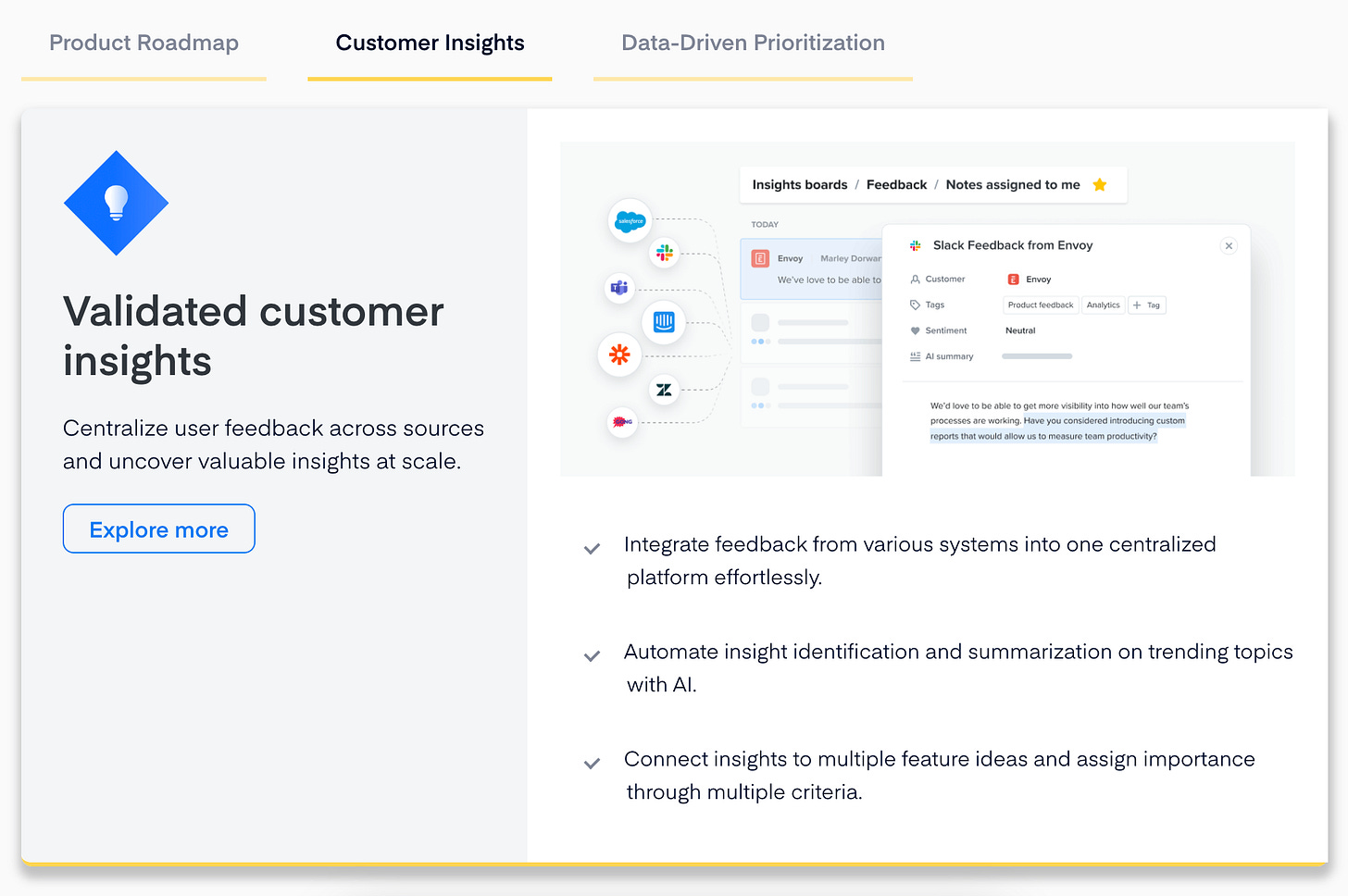
PMs use it to collect customer feedback, create roadmaps, and take ideas from initiatives to deployment.
Here's an elegant section on their homepage representing exactly that:
Seems this tool is mostly aimed at PMs. My gut tells me heads of product and CPOs might have a login, but they may not actively use it as it's pretty tactical.
Productboard and its competitive landscape
To get a complete picture, let's have a look at Productboard's place in the market.
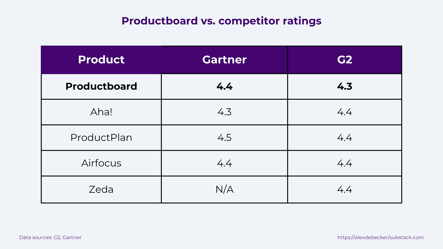
Surprisingly, few tools claim to do what Productboard does. ProductPlan and Aha would be the main ones. There are also lesser-known players like Airfocus and Zeda.
The consensus is that Productboard wins over its market thanks to these qualities:
User-friendly interface. Reviews often mention Productboard is intuitive and has a clean interface.
Excellent for prioritisation & roadmapping features. Reviews mention the visualisation features and how easy it is to prioritise a roadmap based on user feedback & business goals.
Feedback gathering features. Reviewers rave about Productboard's ability to collect, organise, and action feedback.
Of course, reviewers also flag a few cons: high price, a steep learning curve, and too few customisation abilities.
With this context, let's dive into the product and experience it for ourselves.
Free trial and onboarding flow
Productboard offer a 15-day free trial, no credit cards required, and access to all the features.
If you've read my previous Beehiiv teardown, you already know I'm a big fan.
Productboard make it as easy as possible to experience their product. This is a green flag for me, a sign of confidence.
One of the signup process steps is creating a workspace:
It's not clear to me what a workspace is. The first field asks for my company name which automatically creates my workspace URL. So is my workspace my company? What if I work on a different product inside the same company?
Ideally, I'd skip this step for the free trial sign-up. I'd create a temporary URL and extract the company name from the user's email address.
Inviting colleagues could be a good idea but, again, I'd skip this during onboarding:
I wouldn't invite colleagues to a product I'm trialling; not until I've vetted it at least. Interestingly, the next step asks whether I'm part of a team or work alone.
Perhaps the 'Invite colleagues' step could only be displayed to users who specify they are part of a team.
Right, get me to the product!
First impressions
I'm in, whoop whoop!
First impression: there is a lot.
Let's take stock for a second:
Go through an onboarding checklist.
Watch a 3-minute onboarding video.
Read key resources.
Set up integrations.
Invite colleagues.
And that's just the centre of the page.
I'll immediately skip the onboarding video (ain't nobody got time for that). I won't click on the key resources just yet (they might come in handy when I get lost or stuck but I need to experience the product first). I won't set up any integrations (I don't even know what I'm doing yet). I'm also not going to invite any colleagues (for the same reason I skipped that step literally 2.74 seconds ago).
75% of users abandon products within a week because they find it hard to understand (source). Clearly, the checklist is aimed at limiting this effect. I'm usually not a big fan, though. Checklists tend to be a tickbox exercise (badum pshhh).
Some of these items are very broad and scary. For example, step 3 is 'Prioritise your backlog'. Damn, son. That's like my full-time job. Why you gotta stress me out like that?
Thankfully, as I click on the items, they tick themselves off which... defeats the purpose? Oh well. Checklist done. Let's actually use the product.
Clicking around fake data
I can see why some of the reviews reported feeling overwhelmed. There is a lot to learn.
My immediate move is to head over to the Teamspaces. There, I can see a series of boards: prioritisation (2x), delivery planning, timeline, and more. Here's one of the prioritisation boards:
I love that it's preloaded with fake data. It helps me contextualise the product.
Two years ago (when I first tried it), Productboard had a similar set of 'fake' data loaded into boards. However, back then, they had tried to make the data about a fake product.
Sounds better in theory, but in practice it was impractical. It wasn't clear what Productboard component related to which element of the product management process.
With this version, everything's much clearer. We can see what a feature is, what a user story is, and so on.
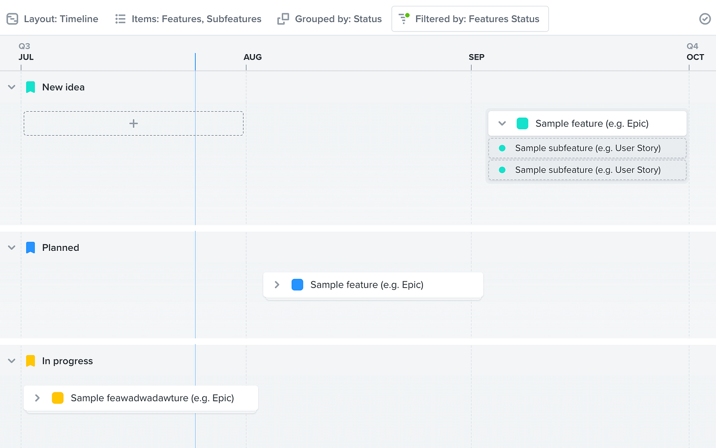
Here's a timeline board:
The same data (`Sample feature (e.g. Epic)`) is visible in a different format. Fantastic. Little by little, I learn these boards are different visualisations of the same data.
I can see myself using the Prioritisation board a lot. Playing around with the filters and the columns a bit and customising the view would be super powerful. I can clearly display things like:
Business value
Insights
Customer importance score
And prioritise my roadmap using this data.
This feature alone seems like a win to me. Now working at a Jira company, I find organising the backlog is a massively manual process.
With Productboard, I can organise the work in a few clicks and make the board extremely insightful for all my stakeholders.
Gathering (customer) insights
At the corner of my eye, I spot `Insights`. I've seen this feature get a lot of praise in the reviews. It's also one that piqued my interest while navigating the marketing website.
Collecting feedback, insights, and requests from customers is, obviously, a huge deal in product management. Even if you're not going to action everything (remember: data-informed), capturing and organising it is a massive pain point for me.
Productboard make this a breeze.
The sample data is, again, extremely helpful. It's immediately clear how data is collected, rated, and organised. It's also clear how these insights then pour into the roadmap items we've seen earlier.
Productboard make another thing clear: feedback isn't just from customers. PMs deal with lots of feedback sources: stakeholders, 2AM emails from the CEO (panic), product reviews on G2Crowd, and more.
It's all in there, centralised, organised, prioritised. It's beautiful.
This feature alone would make any product team much more efficient. Combine it with the prioritisation boards we've seen earlier and you've got yourself a winner.
A steep learning curve
So far, I've only explored two features: prioritisation boards and insights.
Productboard offer so much more. Looking at the nav, I can see reports, portals, insights, segments, and about a dozen more pages.
At this point in my test, I feel a mix of empowered (I can do so much cool stuff!) and drained (there's so much more I need to figure out). I can see why some reviews mentioned Productboard being a bit of a learning curve.
The Data section is a good example of this. Here are some of the things you can do:
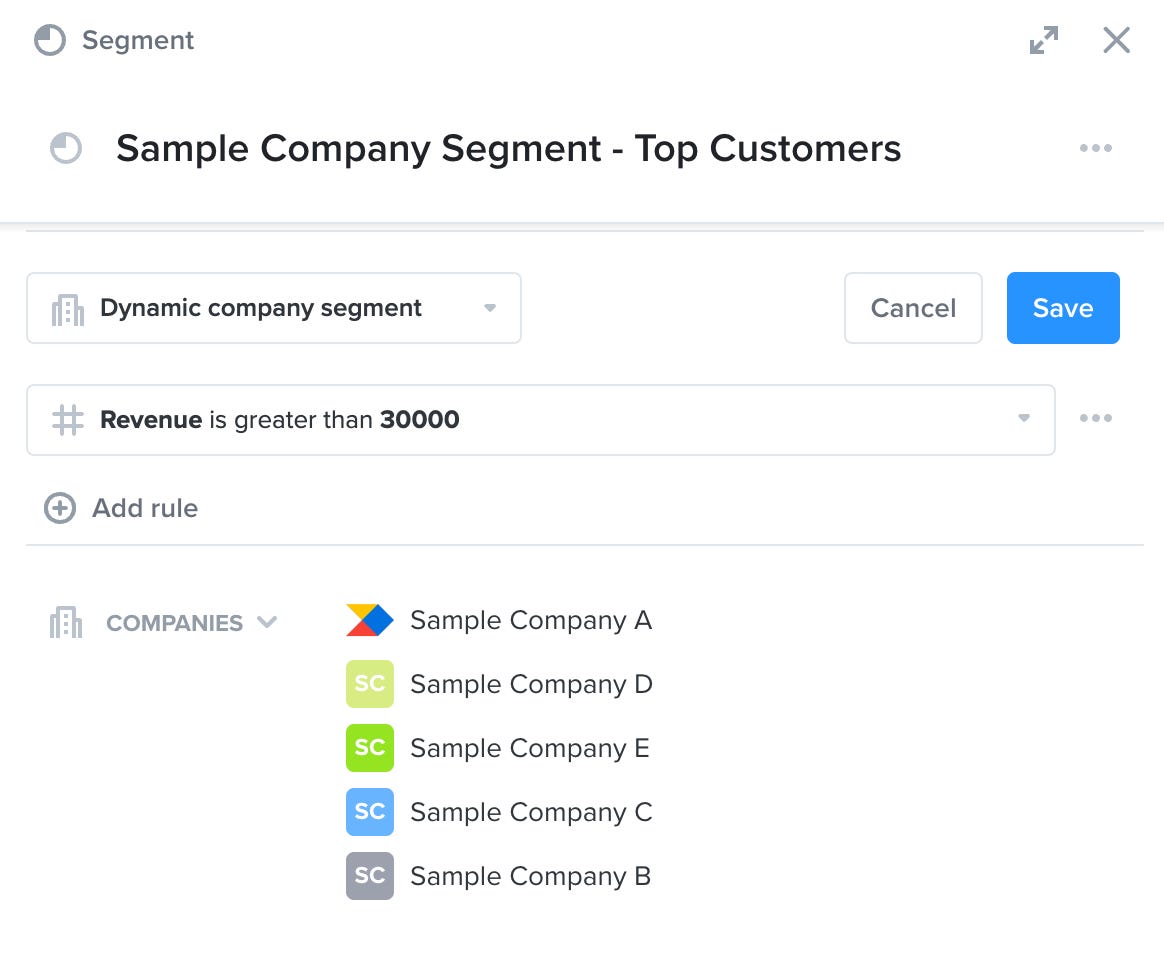
Segments
Segment companies or users based on rules (e.g. companies with >200k in revenue).
This should help you drill down into the behaviours, requirements, and insights from each segment.
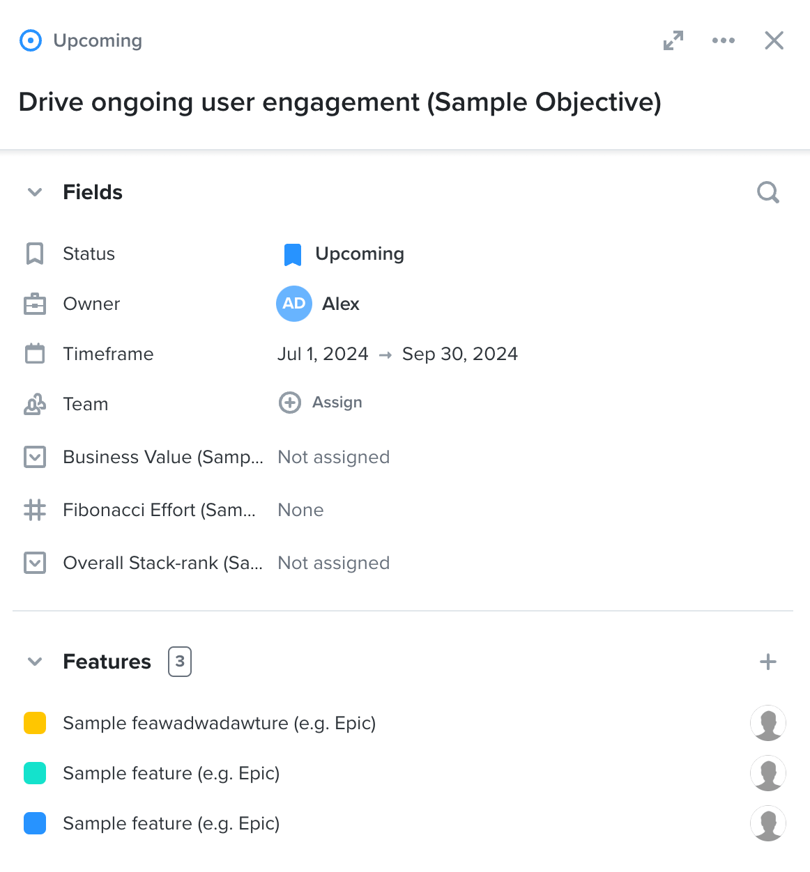
Objectives
Create overarching objectives for your business.
This should keep every bit of work on track towards your goals. You can then tie each feature to an objective to show progress.
Releases
Group the work you've shipped into releases.
This should help you create release notes and report on the work achieved.
Most of these features are good. But they quickly feel overwhelming. There is so much to set up. Daunting.
Lack of clarity
Due to the above, some of the features lack clarity.
Let's take the Portal feature as an example. Here's the preloaded, fake data view:
It's not immediately clear what a Portal is. Is it another way to gather Insights? It seems like a feedback tool, so perhaps. What are these sections? Why would I (the PM) 'submit an idea'? What kind of idea?
Because I've experienced it before, I know what a Portal is. It's a semi-public view of potential roadmap items. Customers can vote for features, submit ideas (there it is), and comment on other people's ideas.
Fantastic feature! Unfortunately fairly unclear for a new user.
Here's another example: Personal.
What is this 'Personal' section? I've gone through the Teamspaces where it's clear we're presenting organised versions of our roadmap. Why is there a different 'Personal' timeline?
It's unclear what the difference between the Teamspaces and Personal boards/timelines are or why they would be needed.
Adopting a product management tool
It's clear from my experience (and, hopefully, from this teardown) that Productboard is a worthwhile tool for product teams.
I have no doubt Productboard, once adopted, will help most teams save time, organise their work, and align the team. It's also a beautiful tool which certainly helps.
It's also clear Productboard should be seen as an investment. And I'm not talking about the monthly cost (very affordable, btw):
Setting up Productboard properly will take time.
Product teams without a proper tool in place probably have all this information scattered around various tools. It will take time to move everything across, understand the structure, understand the tools, and set the processes in place.
Even loading up the ideas, backlog, and insights will take time.
But it'll be worth it.
Once it's all in there, I expect Productboard would become your central hub for all product things; something we product teams have desperately been missing.
Overall, I'm extremely impressed by Productboard. The reviews and ratings I've seen are fair (including some of the 'cons'). The expectations I had reading the marketing website have been met.
Is it for everyone? Probably not. I'd expect brand-new products wouldn't get much out of Productboard. If you're not getting much customer feedback yet, for example, I'd suggest it's probably overkill.
But then again, their free plan is, well, free. So why not start your product journey on the right foot?








Great post! I will have a look.
Great teardown. We're actually weighing getting this product or Aha! - I think the lean from the org is Aha.