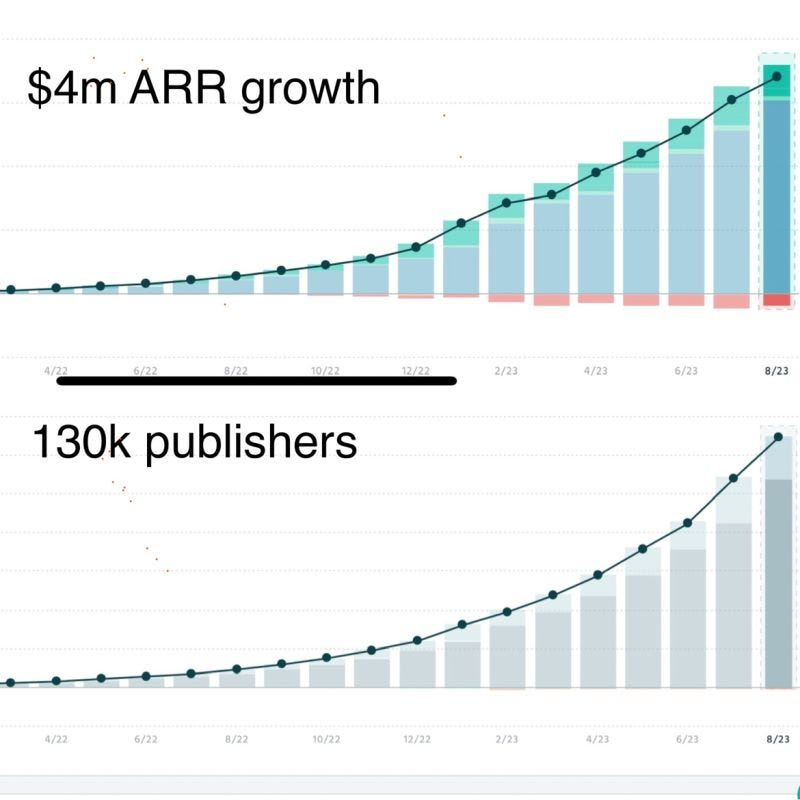
Beehiiv have had a meteoric rise in the newsletter industry.
Their growth has been hard to miss.
As a Substack user myself, I can't help but wonder: what are these guys up to? How do they differentiate their product? Could I be more successful with their platform?
Homepage and USP
Before I jump into the product, I take a moment to reflect on what I expect Beehiiv to be. I believe Beehiiv is Substack for indie hackers.
Let's dive into their marketing website to see if that checks out.
What's the promise? What can I learn about the product's offering, its differentiator(s), and its target audience?
'Built for growth without complexity'.
Vague enough. If I had no idea that Beehiiv was a newsletter tool, I'd probably be a bit confused. Growth of what? Sounds like I'm meant to be doing something that's complex and they can help make, presumably, less complex, but what?
PS: Since drafting this post, Beehiiv have changed their homepage headline to 'The newsletter platform built for growth'. Much better imo.
As I browse through their marketing website, their USP becomes clearer. It's a newsletter tool, sure, but primarily a newsletter tool that focuses on monetisation.
'The value is in the list' is an adage as old as (email) marketing. Yet, somehow, monetisation has historically been dissociated from the list itself. You'd grow an email list and market an offering through it. It has never quite been a native interaction.
Beehiiv's promise is two-fold:
They'll help you grow your list.
They'll help you monetise your newsletter (aka list) natively.
I expect both to go hand-in-hand. Growing my newsletter is likely going to cost me money (cost per subscriber) which is likely going into other newsletter owners' pockets. That's the play, right?
Ok, that's enough website browsing. I hop into the sign-up flow.
Sign up flow
I'm immediately pleased by a few elements of their sign-up page.
First, a 30-day free trial. Yay! I'm not sure what that means yet, but free can be good.
I've grown a bit suspicious of free trials. I worry I'll spend hours setting stuff up only to realise, 30 days later, that half of it is under the highest plan. I'm hoping the distinction between free & tiered features is clear once inside the app.
Second, 'No credit card details required'. Beautiful. Blissful. Nothing worse than a free-but-credit-card-required trial.
Third is the brand. I'm enjoying this playful, colourful design.
Am I a newbie?
This screen puzzled me.
I guess it's a fair question. I'm sure it helps Beehiiv segment its users. But what am I?
I have a newsletter (on Substack). Am I experienced? They're qualifying 'experienced' users as 'having an existing newsletter' which worries me. Will I be forced to import subscribers? I don't want to do that.
I'm not a newbie. I've been marketing for over 15 years. Yet I am, in fact, starting a new newsletter on Beehiiv.
I'm not exactly curious or 'interested in newsletters' either.
I'd be curious to see how Beehiiv use this data. At the very least, some of the wording should change.
Setting up my newsletter is, again, straightforward. Beautiful branding. Simple instructions.
I'm hyped!
Not just a newsletter tool
As I'm asked to confirm my free trial, I'm presented with the litany of features Beehiiv boast. And there's loads.
It's clear from this screen that they're not 'just' a newsletter tool. Until now, I've been comparing them to Substack. I have a sneaking suspicion the product isn't going to compare at all...
First experience
I'm in.
My aforementioned suspicions are confirmed: there is a lot.
Having spent a good portion of my life in marketing tools, this product is much more akin to a Mailchimp or a HubSpot than a Substack; even at first glance.
I spot the usual suspects. Metrics, onboarding checklist, and a dark red reminder that I don't have a single subscriber yet. It's all there.
My eyes are also drawn to new stuff.
The Grow menu (top left). What's that?
The Monetization option below. Can I make some cash?
I realise Monetization is also mentioned above the homepage metrics. Clearly a key metric for them (and for me).
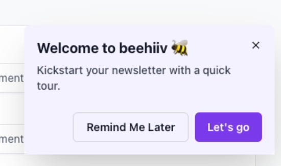
I'm excited to explore. In the bottom right, there's a tour widget.
Ugh. Not a fan. I'll click it to ensure I don't miss anything. I speed through it, as I'm sure most people do.
Onboarding checklist and feature prioritisation
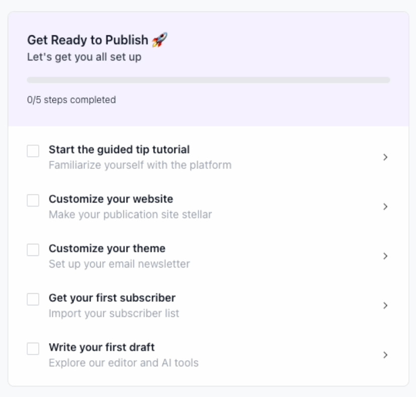
I'm much more interested in the onboarding checklist.
Clicking the tour widget ticked the first item on my list. One down!
Next, I'm asked to customise my website.
Odd.
This feels early in my experience of the product. I have no clue what my 'website' will look like. Also, a website? I thought I was signing up for a newsletter tool.
Worse, as I click around trying to change my website's colour, nothing happens. I almost immediately give up and go back to the homepage. The item on my list is ticked, but I'm none the wiser about the platform.
I think I just want to start writing?
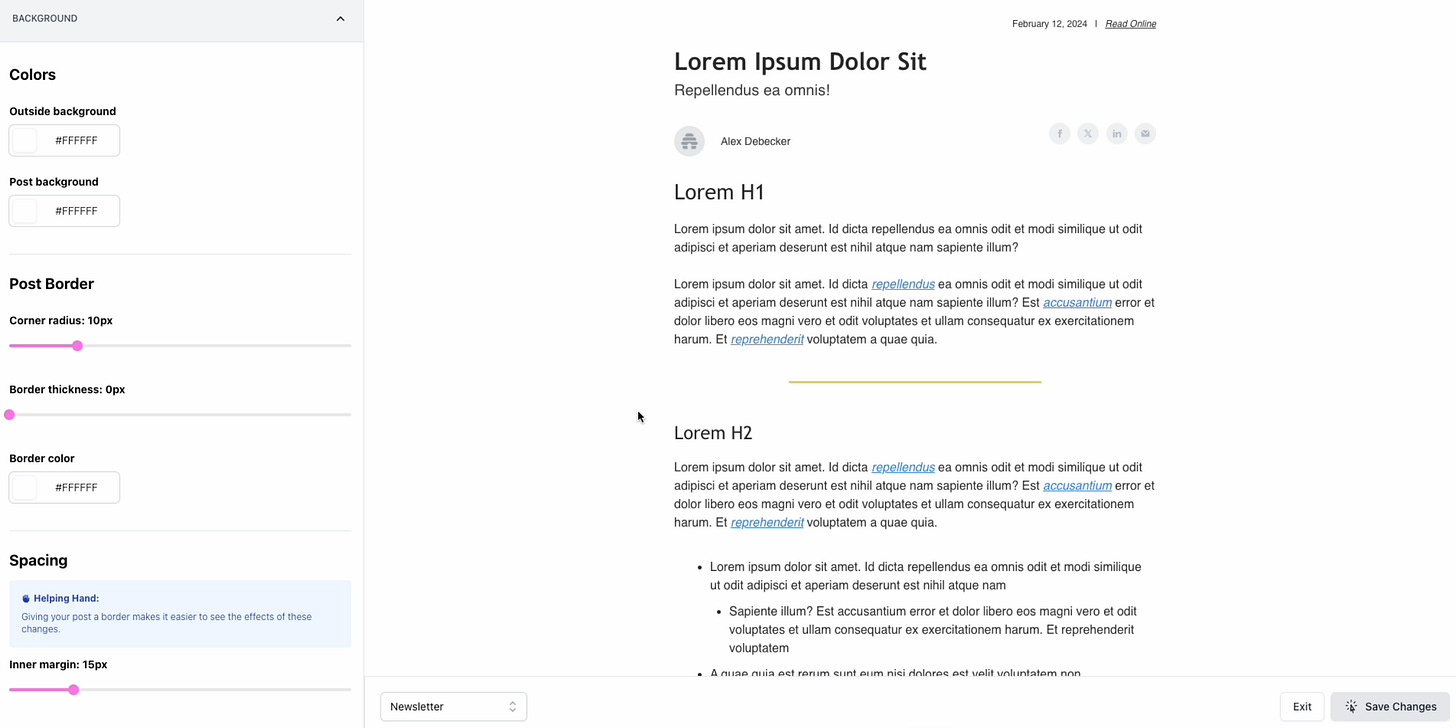
Next, I should customise my theme. This makes more sense. I can customise the look and feel of my newsletter. This is cool! I can't do that with Substack where styles are uniform beyond very basic stuff like like colours. This is clearly a huge differentiator against them; but a table-stakes feature against HubSpot or Mailchimp.
Step 4 is to get my first subscriber.
I get why this is a step in the checklist; it's clearly a highly important goal for me and Beehiiv. I suspect they use this as an activation metric.
However, this is also quite demanding. I just started my newsletter. Who's going to subscribe to an empty newsletter? If I had subscribers to import, what would they see?
During my onboarding, I ended up picking 'Newbie' in the confusing self-selection process. What makes them think I'd have a subscriber ready to go anyway?
I'll have to skip this for now, which means my checklist will remain incomplete and is hurting my brain.
Finally, time to start writing.
Writing my first draft
Writing on Beehiiv is a beautiful experience.
First, it's straightforward. You are presented with a blank page. A blinking cursor reminds you that, of course, you can type. A light grey placeholder also teaches you to hit / for more options. And when you do:
Beautiful.
This UI is superb; colourful and engaging. It resembles Notion's, which I'm also a user of. I can't help but compare this to Substack or even HubSpot where the writing experience is dry, with an old-school text editor bar.
I'm also immediately drawn to the right-hand panel. I can tweak my SEO, differentiate formats between email and website, manage the delivery, and lots more. Marketer Alex is very happy.
If it wasn't clear before, it's abundantly clear now: Beehiiv isn't just a newsletter platform. It's a marketing tool that happens to do newsletters.
Time to get rich
While newsletters aren't new, there certainly has been a recent boom in the industry. The Hustle (acquired for ~$20m), Morning Brew (acquired for $75m), The Milk Road (from 0 to acquired for $millions in <1 year) all contributed to this boom.
It is now my turn.
I think of riches as I head over to the Monetization tab. I'm not quite sure what I'll find and... unfortunately, I find nothing.
The Ads section is empty.
I assume it's because I haven't written anything yet. But couldn't there be some ideas of the type of stuff I'll be able to do eventually? I did tag my newsletter during my onboarding sequence (Business, Product Management, Marketing); isn't that enough to give me a little taste of future options, and a little motivation?
The Subscription section is also a bust. I have no subscribers, so charging for subscribers is out of the question right now. Again, I have no idea how much I could make from this feature.
It's a shame because it is Beehiiv's stated mission: to help me grow & monetise my list. Starting a newsletter from a blank page is scary enough; there should be some indication of success at the end of the tunnel.
It'll have to wait.
Growing an audience
I take a final lap around the platform, landing in the Grow section.
Beehiiv offer a built-in referral program. This, again, feels like a beautiful differentiator against the Substacks and HubSpots of the world. Set up some milestones and rewards, and watch as subscribers bring you more subscribers. The perfect flywheel.
The Boost section is clearly the other side of the Monetization marketplace. Here, you can advertise your newsletter on other newsletters and pay per acquired subscriber.
I'm excited by this marketplace and its native growth tools. I've always felt this disconnect between the list and your other marketing channels (website, social, etc.) very strongly. Beehiiv provide a way to grow that's internal, part of the value of the platform I'm using.
Going back to the well
Over the following few weeks, I published six newsletters.
One of the first features I used, which didn't make it as part of the onboarding, was templating. Beehiiv offer so much customisation that it's worth spending some time putting a template together and... sort of forget about it afterwards. The vast customisation options can sometimes create more friction than you think.
Writing each post felt like a breeze. I continue to enjoy their text editor.
Organic growth
It looks like organic growth isn't as simple on Beehiiv as it might be on Substack. Everything seems tailored to upgrading to a paid plan and paying for subscribers, whether through ads or referral rewards.
In comparison, Substack have done a good job at creating a community of writers. Their native social network, Notes, is a fantastic driver of growth for early users. When you're starting out, it may not make sense to invest in advertising. And no one's going to care about your free swag for bringing 5 referrals.
What now?
Would I move my Substack audience over to Beehiiv? Probably not.
Beehiiv is a more business-oriented newsletter tool. It's well-suited for individuals looking to monetise their newsletter and make it a business.
For 'journalistic' writing, which is roughly the format of this newsletter, Substack feels more suitable. It's simpler, more straightforward, and doesn't require any upgrades (so far).
That's the beauty of product & market differentiation. What may, to the untrained eye, look like competing products aren't exactly that.
Beehiiv is a beast of a product. As Shaan Puri would say, It's beautifully done. It caters to a specific audience and solves a particular need. It's everything a SaaS product should be. And their success so far only confirms it.





This is an awesome teardown Alex. I actually went and signed up after seeing that Note you posted and had very similar thoughts to what you put in this post. Their marketing emails after the fact were a little extra as well.
Great teardown, thanks Alex!
Probably makes sense to start posting the same content on both platforms once you get to a point where you have enough following on at least one to try to tap into the organic users specific to each platform.