A few months ago, I published my Productboard teardown. At the time, I came across Airfocus, one of their key competitors.
This was the first time I had heard of Airfocus, which is surprising as they rank so well on review sites.
Intrigued, I saved the product for a rainy day and an eventual teardown.
This time has come.
What is Airfocus?
My first stop is Airfocus' marketing site. I want to understand how they present themselves, what they offer, and whether or not their product delivers.
A quick Google search shows Airfocus call themselves a 'strategic product management platform'.
Sounds exciting (for a product nerd like me).
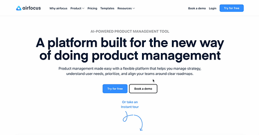
The marketing site is beautiful. They proudly boast: "A platform built for the new way of doing product management".
A new way of doing product management? Colour me intrigued.
They clarify their claim: Airfocus is a platform that helps product teams manage strategy, understand customer needs, prioritise, and align teams around clear roadmaps.
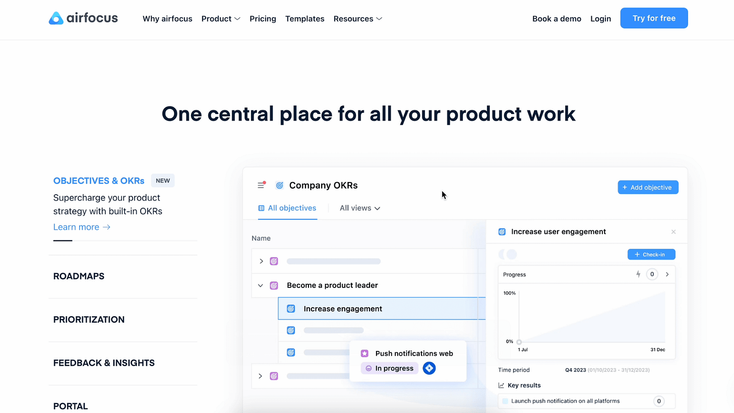
Here's a pretty section covering all this good stuff:
We've got objectives, roadmaps, prioritisation, feedback, and a portal. Seems Airfocus have it all.
Airfocus and its competitive landscape
As I alluded to in the intro, Airfocus competes with a few familiar faces:
Public reviews highlight the following product benefits:
Centralise & visualise all product work. Aligning stakeholders remains a key pain point for product managers. Reviewers overwhelmingly report Airfocus helps them with that.
Excellent prioritisation features. Along with roadmapping and visualisation, Airfocus helps users prioritise their work.
A strategic tool. Lots of reviews mention Airfocus being a key strategic tool, a 'one-stop-shop' for all aspects of their product strategy.
Sounds promising.
Some of the negatives are: confusing user roles & permissions, a lack of workflow automation, and an overwhelming setup process.
I'll keep an eye on these and see if they resonate with my experience.
Sign up and onboarding
There's a fun little marketing trick on Airfocus' homepage:
Clicking 'Instant tour', I expected a video tour. Instead, the image fades and presents a 2-field signup form! I fill out the short form.
It's clear Airfocus want to gather as much information as possible during the onboarding flow (which reminds me of this excellent onboarding Clickup teardown).
Company name, phone number, role, seniority, company size, current tech stack; the usual suspects are there. I'm hoping they use this information to tailor my free trial.
Next, we're setting up Workspaces.
I'm not sure what a Workspace is. I encountered the same problem during my Productboard onboarding. Is a workspace my team? My product? My portfolio?
I'm first asked to tell them what brings me to Airfocus.
I tick all the boxes, can't wait to hit 'Next' and experience the product weeeeee...
Nope.
Personalised onboarding?! I don't want to talk to a human! Let me play, please.
I panic. I can't see an X. I can't even close this modal. I refresh the page but that doesn't do it either. I have to schedule a meeting.
Aww man.
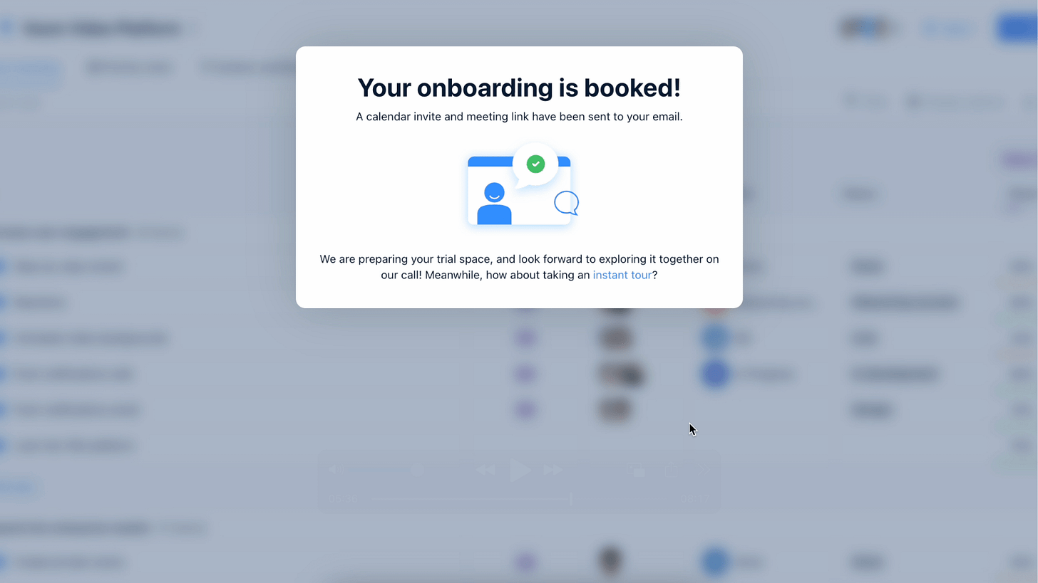
I've got one more trick up my sleeve. I'll schedule a meeting which should hopefully close the bleedin' modal and let me into the app. I can always cancel the meeting later.
Nope again.
The next modal is also locked. I can't close it. There's a tiny 'instant tour' link which gives me hope... but not for long.
I'm taken to a fake platform with an HTML tour. It's informative but I can't click anything myself. It's images, text, and 'next' buttons.
The final step of the HTML tour is... another button to book a demo!
Look, I know why products do this. Some products are so complex they require human onboarding. It also helps create a relationship with the sales team early on.
But, in the case of Airfocus, I feel like I could figure it out on my own. I was all set to experience the platform, dive straight in. Instead, I'm now forced to sit on my hands and wait.
Free trial
I managed to sneak past the demo requirement with a poignant email to the salesperson assigned to me. They may hate me now but hey, at least I'm in.
The free trial is an account loaded with fake data.
It's easy to overwhelm new users with this approach by displaying too much, turning too many features on, and having too much data. But Airfocus find the right balance.
Let's explore.
Workspaces
My account has three preloaded workspaces: two individual products and a portfolio. For each product, I can navigate between different 'views' of the data.
Here's a timeline view for example:
And a Gantt view:
After exploring the 'products', I look at the portfolio section. The portfolio is a combined view of both of my products. Neat.
For example, here's the portfolio timeline view, a combination of Product 1 and Product 2 timelines.
This is very cool.
I feel a real sense of hierarchy between workspaces and views in Airfocus. It's immediately clear how a portfolio company would organise their products.
The views allow for easy customisation, enabling me to display the data in a way that suits my preferences while accommodating how other stakeholders may want to see it.
Finally, this little exploration allowed me to experience the UI and... it's beautiful. Everything seems clear, neat, and easy to use.
Items
Time to drill down into individual items.
I'm immediately drawn to this:
It seems a product workspace only allows you to add epics.
That's a bit surprising (I'd expect to be able to create bugs or 'smaller' tickets) but, after thinking about it some more, I quite like it.
Assuming Airfocus is the central nervous system of our product strategy, we need it to remain high-level. We can handle details later on in development tools like Jira.
Here's a detailed view of an epic:
Again, although it seems quite bare, it's actually all the important stuff. I can:
describe the epic,
assign it to someone,
attach files & comments,
assign an impact, revenue, and effort (for prioritisation),
assign a theme, and,
move it along a timeline.
You essentially can't go wrong. Any PM with a bit of experience would know how to work with this.
I was confused by the Theme.
I get what it is meant to represent: a theme is something the business is focusing on right now, perhaps an overarching goal. But where do we set these themes?
I can click on the theme and hit 'manage field' which takes me to a bit of UI where I can CRUD the themes.
Mmm... ok. But the UI makes me feel like I shouldn't touch it. It almost looks like backend settings.
I'd like to see Themes being brought up in a more significant place in the product. Again, if Airfocus is a representation of our product strategy, themes are important and we should take their creation and management seriously.
Scoring & prioritising items
As some of you may know, I'm not a huge fan of prioritisation frameworks.
With the right product strategy, prioritisation should come organically.
I do, however, understand the need for a scoring functionality in a tool like Airfocus (which, by definition, users will use to prioritise work).
I mess around with the views to display this:
The 'Score' is a simple two-digit number generated from three metrics: impact (0-10), revenue (S-XL), and effort (0-10).
The feature itself is great and easy to use. I can modify the formula to my requirements by changing the weights, adding criteria, and more.
This level of flexibility is excellent.
Yet this also highlights why I'm not a fan of prioritisation frameworks. It's both easy to game the system (by tweaking the weights) and virtually impossible to create a reliable formula.
But this is neither the time nor the place for this debate, so let's move on.
One final thing I like is the priority chart:
This is fun! Very easy to understand and communicate with stakeholders (as long as they don't ask you what formula you used to generate this view because... Alex shut up about this).
Workspace templates
There's a tempting little + button right here I really want to click.
Let's see what happens.
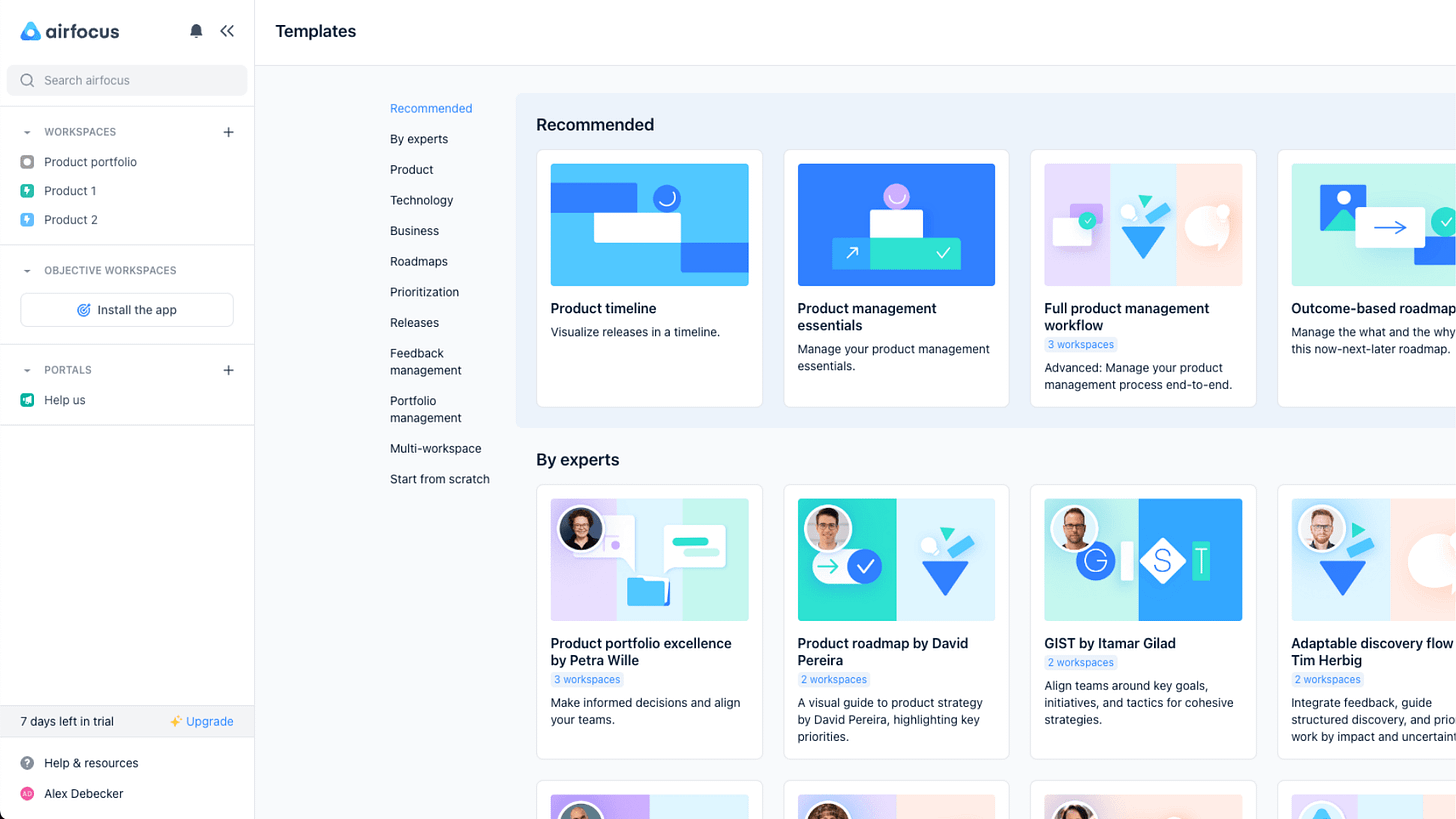
Templates!
One of the challenges with product management tools like Airfocus, as highlighted in the reviews, is their complexity. Setting everything up can feel overwhelming. There are loads of features, possible configurations, ways to view the same data, etc.
These templates solve this pain point.
Here are a few templates that stand out:
Value vs. effort prioritisation. Again, not a huge fan of prioritisation, but if you had to, this template is excellent.
Portfolio excellence. Setting up one product in a tool like Airfocus is complex enough. Imagine setting up a whole portfolio! Bam, this template solves that.
How Airfocus uses Airfocus. I mean, that's just the best. You're literally able to 'steal' their setup. Can't go wrong with that.
Each template has a description and even a clickable preview:
This is officially my favourite part of this product. I can tell they took the job-to-be-done of setting up a new product (and its pain points) really seriously.
This should be the gold standard for any platform attempting to minimise complexity with templates.
User experience and UI
I've now been browsing the app for a couple of hours (on and off, I do have a life you know). I'm struck by how simple, clear, and clean the experience is.
Everything is beautiful and easy to use. Even though Productboard and Airfocus look sort of the same, I feel navigating Airfocus is less confusing and brain-intensive.
The platform is not without flaws, of course.
For example, I got stuck trying to create a Portal. I got to this screen and completed the fields, but the 'Update' button wouldn't activate. See if you can spot what to do next (no cheating):
Do you see it?
There's a separate tab at the top:
Even doing this, I still got stuck at step 3. The portal seems to be there, but I can't access it. The modal tells me to 'go to the workspace associated with the portal and add an item'. But I can't find which workspace or how to add the item.
I'm sure this would have been covered during the face-to-face onboarding I eagerly skipped.
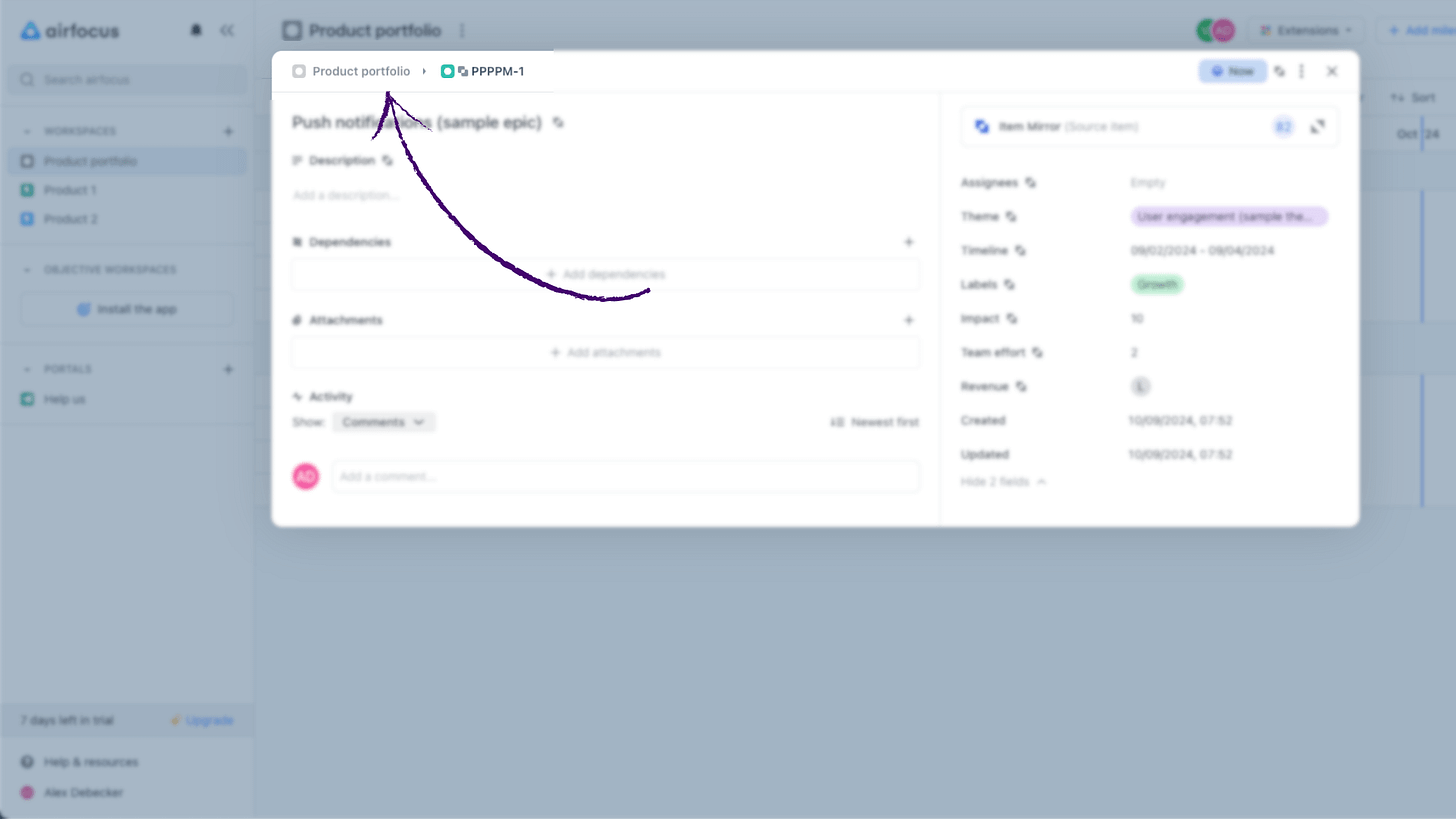
I spotted a few UI annoyances like, for example, some modals have a breadcrumb:
Clicking the breadcrumb closes the modal and sends you back to the workspace. This is counterintuitive to me.
Or, saving a modal doesn't close the modal, a small pet peeve of mine.
As you can see, these are minor (except the issue with the Portal. I'd be curious to hear what I'm doing wrong there, if any reader works at Airfocus).
Feedback and insights
One of the key pain points platforms like Airfocus aim to solve is the collection of user insights.
PMs get feedback from all sorts of places, from the CEO to sales calls to random people on the street. Collecting, organising, and actioning feedback is an important part of the job. And, without the proper tools and system, it can be a huge pain.
Airfocus attempt to solve this with Insights, an app that must be activated:
Highlight a piece of feedback and create an insight by clicking the yellow lightbulb:
You can associate the insight with an existing epic or a new one. This is reflected in the epic itself:
Two things I like about this.
First, they recommend dedicating a workspace to feedback. This keeps everything super clean. Very helpful when presenting to stakeholders. Centralising the feedback in one workspace is also helpful for portfolio companies as each piece of feedback can be distributed to various products.
Second, the interaction of highlighting a bit of the feedback & sending it as an insight is quite clever as it allows you to break feedback down into individual, highly-targeted actions.
Here's an example of feedback (preloaded Airfocus data):
I have a lot of data to transfer and doing it one by one is a pain. Importing in bulk would be easier.
This is presumably an email or a message from a customer. It’s one piece of feedback, but if you break it down, there are three opportunity spaces here:
“I have a lot of data.”
“Transferring data one by one is painful.”
“Importing in bulk would be easier.”
We can actually break this feedback into multiple opportunity spaces and explore each separately, triggering all sorts of interesting questions:
Do we display too much data?
Why are customers transferring data?
Should we transfer data for them as part of the onboarding?
Although a bulk import would be easier, would customers trust it?
If a bulk import takes 10 hours, would our customers be angry?
And so on.
I messed around with the 'Score' formula to take insights into account. It's again very customisable, which is neat but would require a lot of testing to figure out the right formula.
Is Airfocus worth it?
I'm extremely impressed by Airfocus (even more so given that I hadn't heard about them before my Productboard teardown).
The core functionalities are there. The product clearly solves all major PM pain points and the UI/UX is above and beyond.
Adopting a product management tool will always require a leap of faith and an initial investment (in time & resources). Setting things up will force the organisation to face (and resolve) the inefficiencies it had been used to working with until now.
But here's the thing: can you afford not to?
Can you afford not to be organised? Not to take customer feedback seriously? Not to focus on your product's long-term vision and reflect it in every possible process?
If you're seriously looking to scale your product organisation, a tool like Airfocus will make a world of difference.











I use airfocus on a daily basis and it delivers what it promises. I recommend airfocus to any product person! (and I'm not affiliated with them)
Thanks for the review Alex!
I've never used it... but after reading this I'll take a look!