
Product nuggets #1
Productboard, Basecamp, and modals

‘Product nuggets’ is a series I am trialling where I share cool product ideas, designs, and features I find on the web. There are no rules; other than they must be related to products. Every day I am inspired by others’ work. I hope these inspire you, too.
Making the most of your release blog post (Productboard)
I love Productboard, a tool that helps product managers organise their work. I wrote a post reviewing their platform a little while back.
I noticed something really cool they do on their blog, which anyone can steal.
Every quarter they publish a blog post covering their new release, which looks like this:
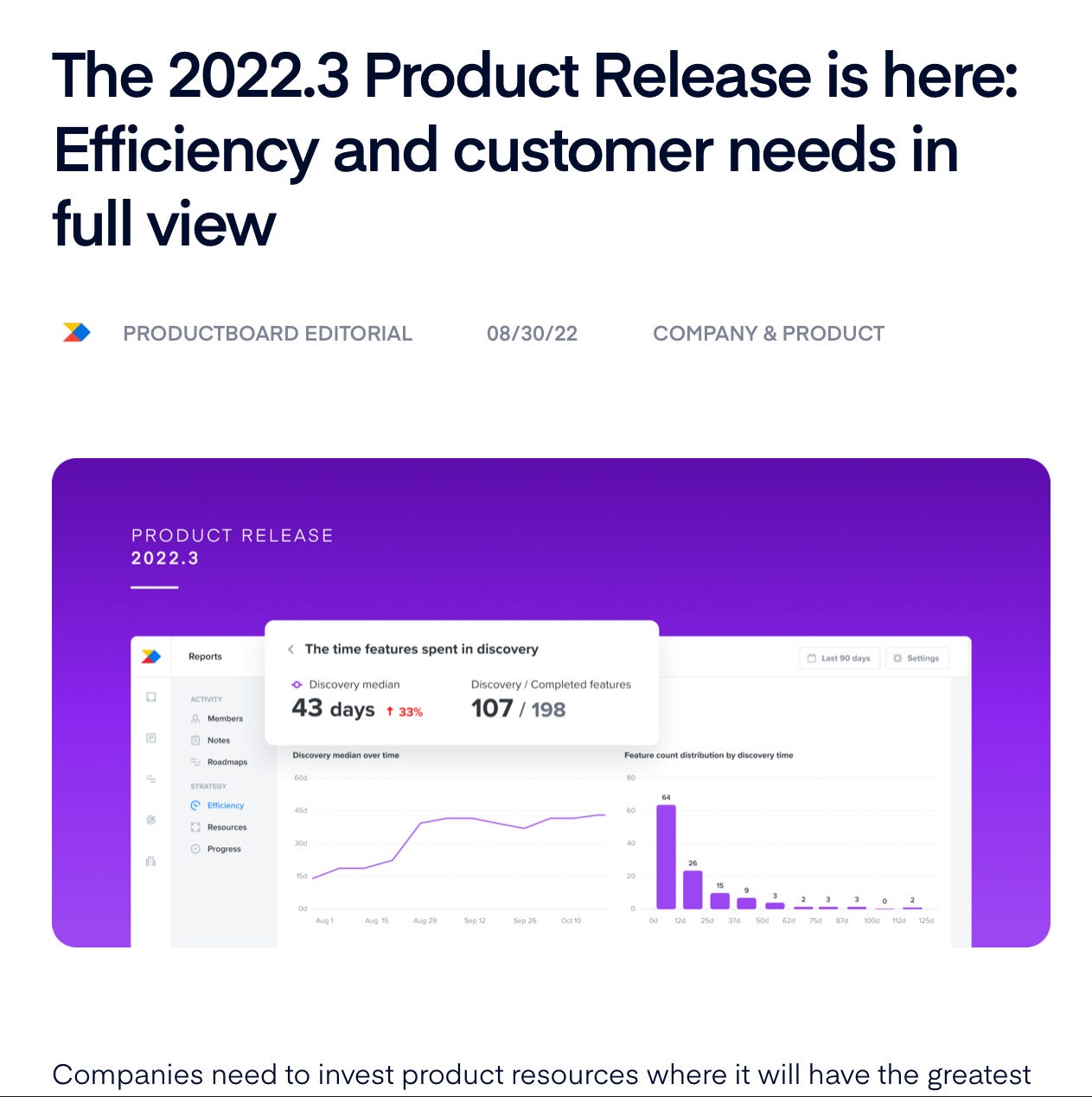
Throughout the blog post, they tout their new features, show incredibly beautiful screenshots of their app, and include customer quotes (something you should definitely steal).
The cool thing happens at the bottom of the post:
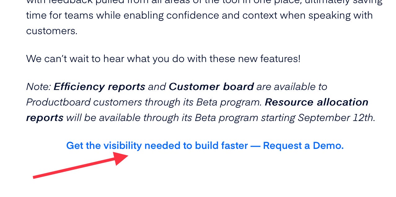
This isn’t just any ol’ CTA. This CTA sends the user to a landing page designed specifically around the new features contained in this release.
Here’s why this is smart:
The user clicked on the CTA from a blog post that touts specific features. There’s a high percentage chance those are the features they’re interested in. I expect this to positively impact their conversion rate.
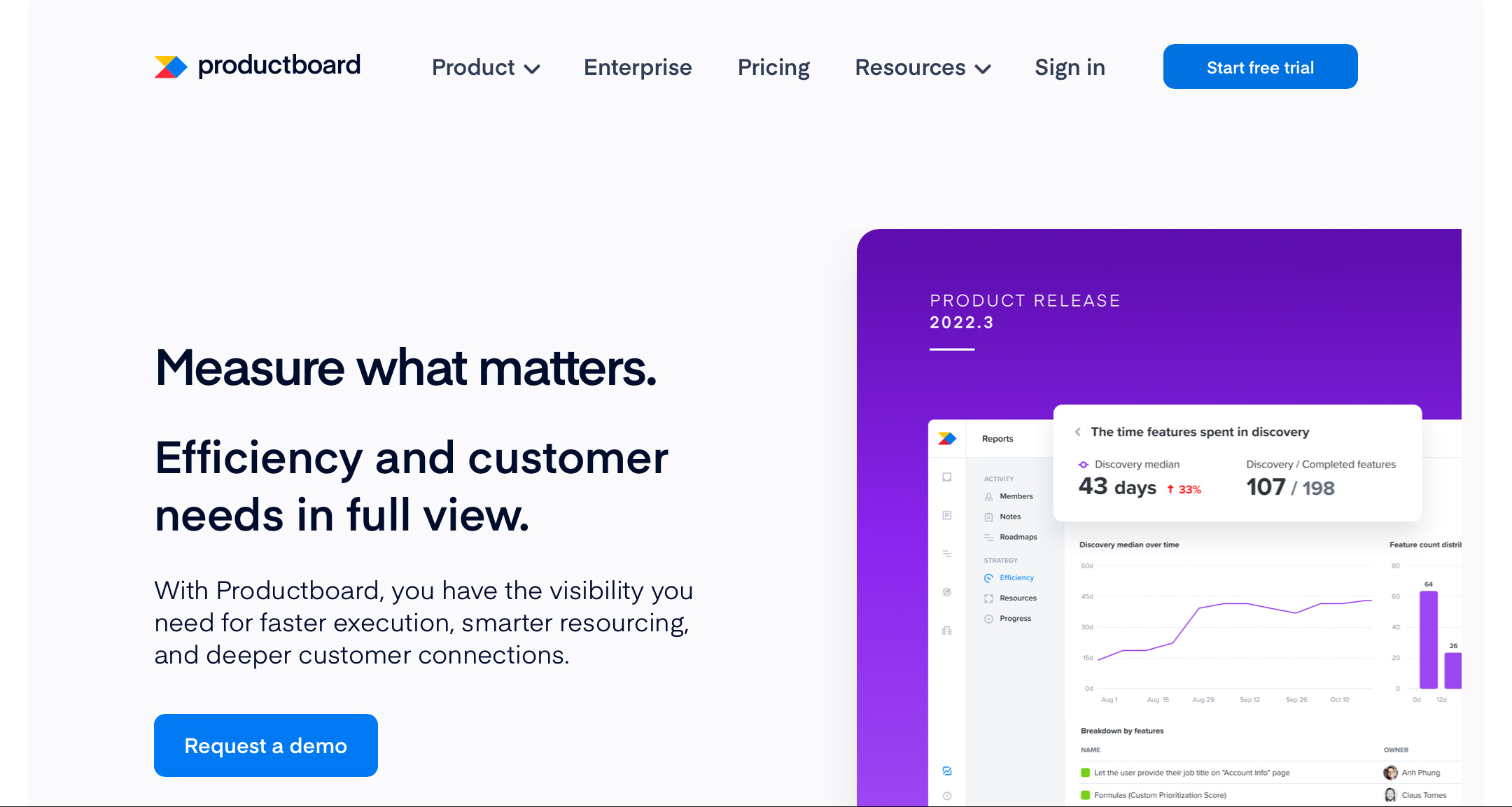
The visual experience is replicated. Notice the blog post’s hero image is re-used as the landing page’s hero image. 10/10 for continuity and customer reassurance.
The words, like the visual experience, are replicated. They know where they come from (the release post), so they know the words that will resonate.
This approach gives them an easy tracking experience in three steps:
Create a blog post with the release number/number (here 2022.3).
Create a landing page using the same number in the URL (here /lp/2022-3…).
Create a CTA linking one to the next.
To experience this, go to their 2022.3 release blog post.
Interestingly, they haven’t replicated this behaviour for their latest release (2022.4). Would be really interesting to know why. I still think it’s an excellent approach.
Read my Productboard product teardown.
Boundaries, no specs (Basecamp)
I’m re-reading Basecamp’s Shape Up and finding lots of nuggets. Here’s one about shaping up the work that stuck with me this week (pulled from Chapter 4):
“This isn’t specs. It’s the boundaries and rules of a game. It could go in countless different ways when it’s time to play.”
This works on several levels.
First, it’s a good framework for organising our thoughts. Putting ‘specs’ together during the shaping phase is too rigid and demanding. At this stage, you don’t know what you don’t know. You don’t even know what you know.
Second, it invites creativity. Might be counter-intuitive, but boundaries encourage creative thinking. If you know you can only work within X and anything outside of that is out of bounds, you get to be creative with X.
Third, avoiding specs at the start leaves the door open for any approaches later on. You’re organised, but not stuck. The second part of the quote is as important; “it could go in countless different ways when it’s time to play”.
The whole book is a nugget in itself and well worth a (re-)read. I’m sure more will crop up in future posts.
Modals vs. Pop-up behaviour
I’m currently working on a very form-driven product. Everything our customers do within the app is done through fields and forms.
These forms come in many shapes and… uhhh… forms:
Pop-ups
Modals
Slide-ins
And so on.
One of the eternal debates we have is around the ‘close’ behaviour of our modals and pop-ups. Should they automatically close when clicking outside of the modal, in the typically ‘grey’ area of the app? Do they need an ‘X’ to close? Do we force customers to save whatever they do before closing?
I found this helpful comment by user wintvelt on UX Stack Exchange on this topic:
In an enterprise webapp we are developing we make the distinction between:
modals: can only be closed through very deliberate action, because closing would break some flow or may cause data loss. These have no X button, cannot be closed by clicking outside modal. Most do have a separate "abort" button, making it more explicit that closing may result in data loss. Example would be a multiple field form.
popups: do have X button, and can be closed by clicking outside. Some have "Apply" button, but no "abort" button. Some close automatically by primary interaction. Example would be an elaborate select list, login window, or popup to read comment thread and post new comment.
This provides a helpful distinction between the two and clear reasons for the choice in behaviour for each. If you use modals and/or popups in your app (or your website), it is worth thinking deeply about your users’ expected behaviour for each.
Thx for the shoutout Alex. You should come join our Productboard Product Makers community www.productmakers.com